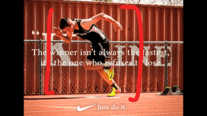
This advertisment was produced by the Nike company, with Simone Biles as the center of attention.
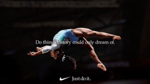
Some of the important design features inclue the type, logo, and the centering of the picture.
The typeface was a Minion variable concept and they centered the text over the subject of the picture to pull the focus there. Along with the placement of the logo and the slogan.
The colors used are very minimal as a majority of them are from the subject. The darkness of the background helps the subject, Simone Biles, to stand out more, alomng with the text.
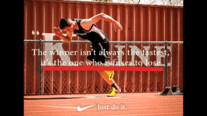
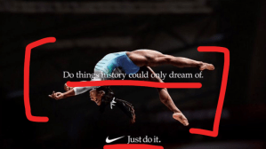
This is the ad I made that is similar to the original Nike ad. The typeface is the exact same and it uses a similar outline to help the text stand out on the background.
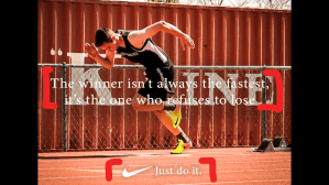
Along with the typeface, it is layed out in the same way, with the text in the center and center aligned, with the logo and text center justified at the base of the image.
The image is similar with the original ad. This brand of nike ad of an athelete in action centered in the advertisement.
Nike produced these types of advertisments with their sponsored atheletes centered, along with inspiring text from them or another inspired person. The ad I created is similar in design, typeface, and coloring.
