This is the original magazine spread created by Ellis Design and can be found here: https://www.ericaellisdesignstudio.com
Typography: This spread uses multiple styles of typography and color to create a spread that is both easy to read and is appealing to the reader.
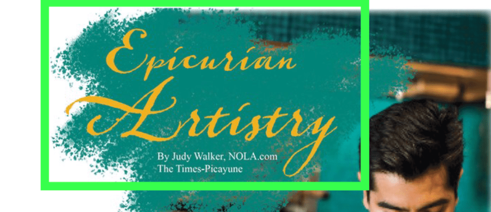
Here they use a Decorative/Script typography to create titles. Throughout the rest of article they use Slab Seriff due to its easiness to read and looks professional.
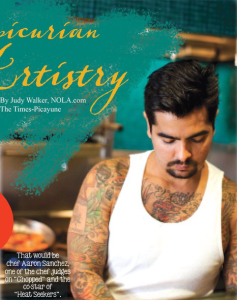
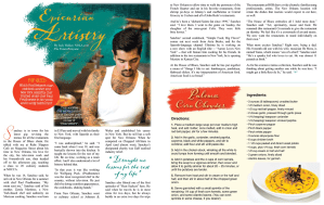
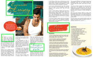
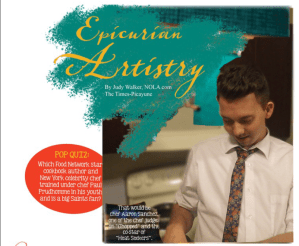
Photography: There are two pictures on this magazine spread. The one of the chef uses the rule of thirds well as it places his head in one of the thirds. It also has the focus all on him blurring out the background creating a good depth of field. The other picture is of a soup that is taken close up. Uses rule of thirds where the bowl takes up the majority of the frame and has warm colors.
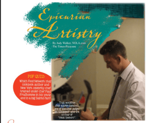

These two photos replicate the one in the magazine spread. Using similar rule of thirds and focus. The actor also has a simialr stance/pose in an attempt to re-create the magazine’s photos. Next is a bowl of water soup. Attempting to replicate the on in the article.
Conclusion: The article overall is spread out well and looks very professional. It uses contrasting colors and typefaces that contrast but match well with each other. The photos in the article are well taken and use the correct rules of photography to liven the piece and add character to it.
